Responsive Viewer
📝 Summary
Responsive Viewer is a powerful Chrome extension designed to streamline the development process by enabling developers to swiftly verify the responsive layout effects of websites across various devices. By providing an intuitive interface and robust features, it enhances development efficiency and ensures seamless cross-device compatibility.
✨ Features
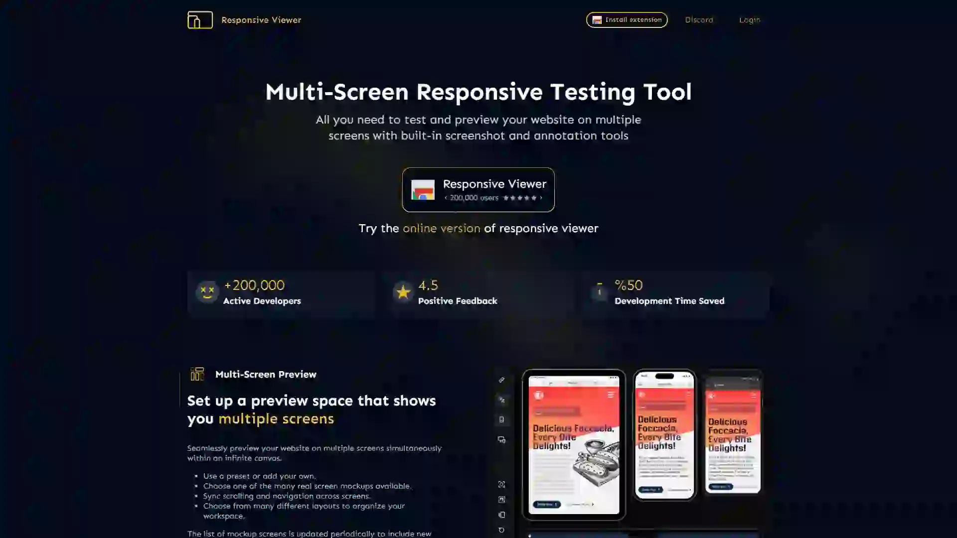
- Multi-Device Viewing: Simultaneously view responsive layouts on multiple devices without manually switching between device modes.
- Preset Device Sizes: Offers a comprehensive range of preset device sizes, including popular phones, tablets, and desktops, to cover diverse testing scenarios.
- Custom Device Sizes: Easily create custom device sizes to meet the specific requirements of unique projects.
- Real-Time Synchronization: Real-time synchronized scrolling and operations across devices allow for effortless comparison of display effects.
🎯 Use Cases
- Front-End Developers: Quickly validate layout compatibility during the development of responsive websites, ensuring a seamless user experience across all devices.
- Designers and Teams: Enhance collaboration by viewing design drafts on different devices in real-time, facilitating smoother communication and faster iteration.
- Testers: Improve efficiency when conducting cross-device compatibility testing, reducing the time and effort required to identify and resolve issues.
⚠️ Drawbacks
- Browser Limitation: Currently supports only the Chrome browser; other browsers are not supported.
- Complex Interactions: Synchronized operations may experience slight delays or inconsistencies on pages with highly complex interactions.
❓ FAQ
Q1: What are the main features and benefits of Responsive Viewer?
A1: Responsive Viewer allows you to view and test responsive layouts on multiple devices simultaneously, with real-time synchronization. It offers preset and custom device sizes, making it ideal for developers, designers, and testers who need to ensure cross-device compatibility quickly and efficiently.
Q2: How does Responsive Viewer compare to other similar tools?
A2: Unlike many other tools, Responsive Viewer provides a seamless multi-device viewing experience without the need to switch modes manually. Its real-time synchronization and customizable device sizes offer a more efficient and flexible solution for responsive design testing.
Q3: Is Responsive Viewer suitable for beginners or professionals?
A3: Responsive Viewer is designed to be user-friendly and accessible to both beginners and professionals. Its intuitive interface and powerful features make it a valuable tool for anyone involved in web development or design, regardless of their experience level.